Dark Paint in Small Rooms: When It Works and Why
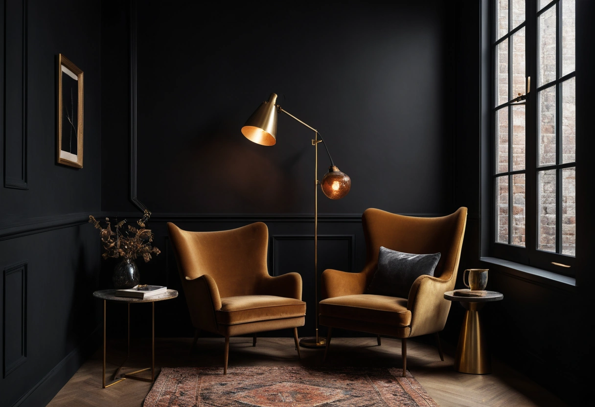
Small rooms don’t need light paint. Light paint makes a room brighter, not bigger, and in a dim room white walls just turn gray and show every shadow. Dark paint works in small rooms because it erases the shadow lines that mark the room’s edges, so the eye stops measuring the box. The working conditions: a color with an LRV under 15, sheen at matte or flat, and at least two layers of light on dimmers.
The myth: light equals large
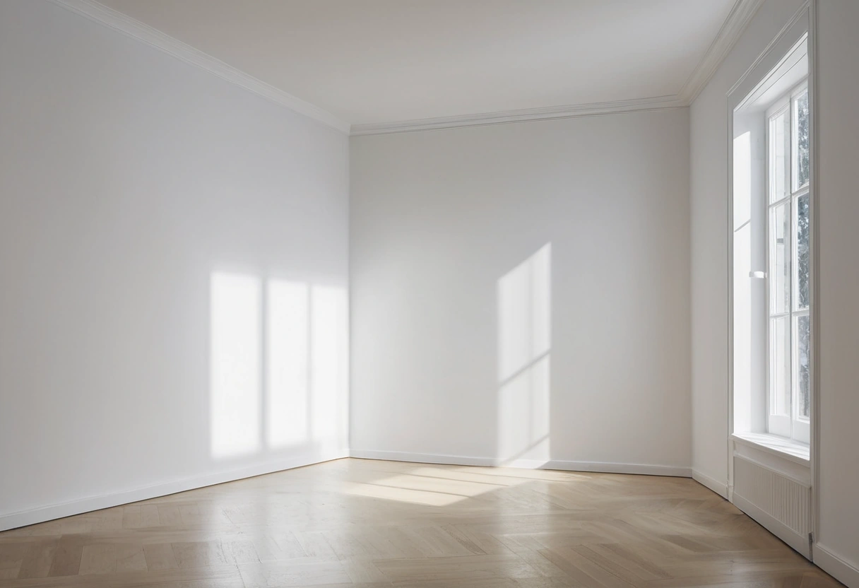
The “paint it white to make it bigger” rule assumes abundant daylight. With big windows, a high-LRV wall does bounce light around and the room reads open. But most small rooms are small because of the floor plan: one modest window, or none. In that light, white walls have nothing to reflect. They go dull gray, every corner collects a visible shadow, and the room reads exactly as small as it is, only bleaker.
Brightness and perceived size are different levers. The tactics that genuinely change perceived size, scale, sightlines, mirror placement, curtain height, are cataloged in our guide to making a small room look bigger. Paint color sits low on that list. What paint controls is mood, and dark paint is honest about a dim room instead of fighting it. Listing photos keep the myth alive, because white rooms photograph brighter; living in a room and photographing it are different jobs, and a dim white den serves neither.
Shadow-line logic: why dark blurs the box
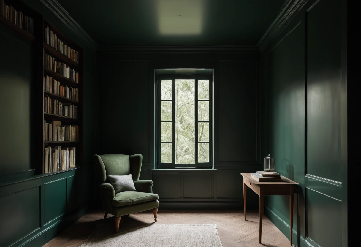
You read a room’s dimensions from its corners and edges, and you see those corners because of value contrast: a lit wall meets a shadowed wall, and the jump in brightness draws a line. On white walls that jump is large, so the box is crisply outlined. On walls around LRV 10, the lit plane and the shadowed plane are both dark, the jump shrinks, and the corner lines dissolve. Painters call it losing the corners, and the effect is strongest when the color runs unbroken across every plane.
With the edges gone soft, the walls stop announcing where the room ends. Depth becomes ambiguous, which reads as spaciousness after dark. Dark backgrounds also push furniture, art, and lamps forward visually, adding a layer of depth a white room lacks. Taking the color across the ceiling and trim multiplies the effect, which is the whole argument for a full color drench: a white ceiling over dark walls re-draws the strongest line in the room.
Which small rooms suit dark paint
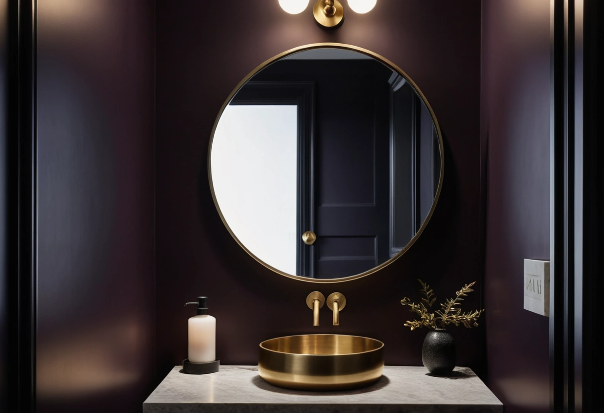
Rooms used in short visits or at night are the natural fits:
- Powder rooms. Artificial light, five-minute stays, and a small paint bill make them the standard first dark room. A bold wallpaper in a durable type does the same job here if flat color feels too plain.
- Dens, TV rooms, media rooms. Dark walls cut screen glare and reflections.
- Dining rooms. Used mostly in the evening, where deep color plus candlelight and dimmers flatters everyone.
- Bedrooms. Dark envelopes read restful, and mornings need only a bright lamp.
- Studies and offices, provided task light is strong.
Poor fits: kitchens and laundry rooms, where task brightness rules; kids’ playrooms; and any room where daytime grooming or detail work happens. Those rooms spend all day fighting a dark scheme.
The lighting that makes it work
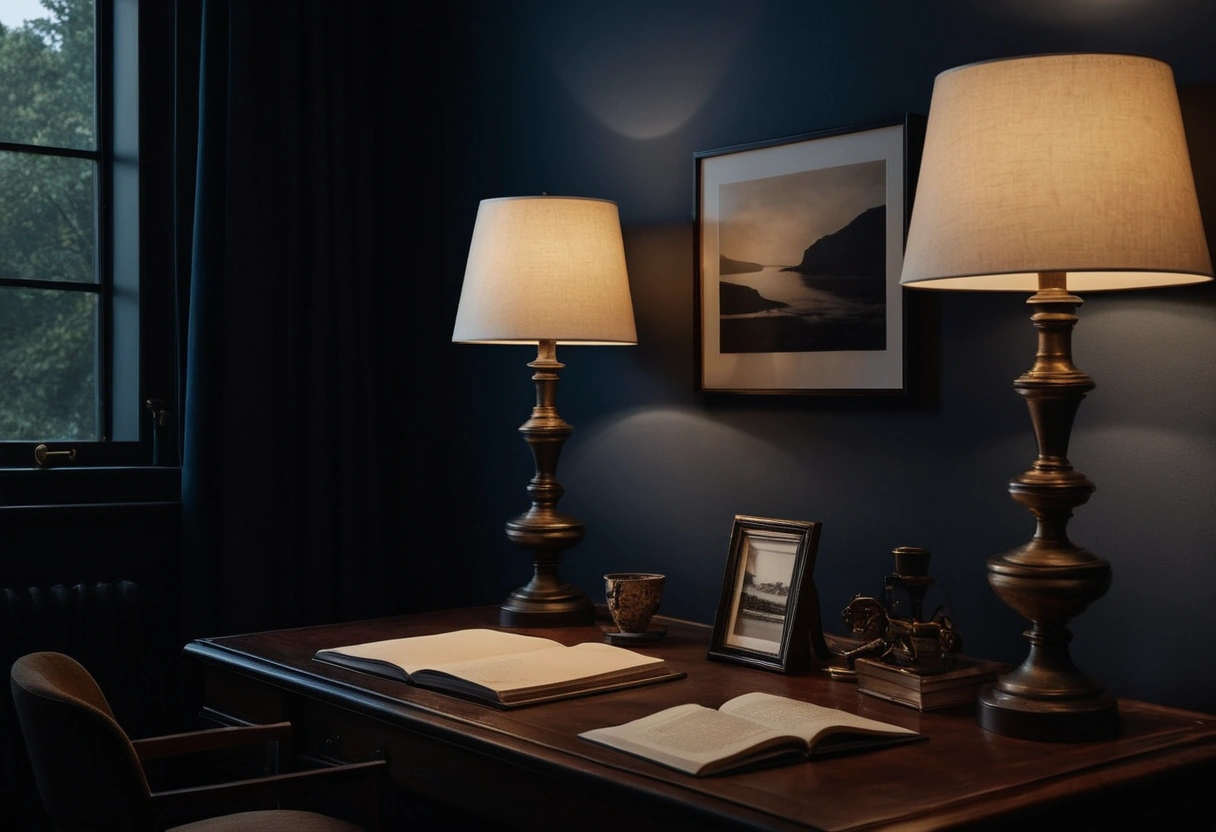
Dark walls bounce almost nothing back. A wall at LRV 8 returns a small fraction of the light that a white wall returns, so a single ceiling fixture leaves pits of shadow at the edges of the room. The fix is more sources, not one brighter bulb: overhead plus a table or floor lamp plus an accent, at two or three heights, all dimmable.
Budget lumens generously. Take the standard per-room targets in our lumens cheat sheet and add roughly a third to a half to offset the absorbent walls. Warm bulbs, 2700K, keep deep greens, blues, and near-blacks rich instead of flat.
Shades matter as much as bulbs. Fabric shades that glow put usable light at eye level, exactly where dark walls swallow it, while open-top metal shades send everything to the ceiling. Wall sconces flanking a mirror or bed do the same eye-level work in rooms too small for lamp tables.
Choosing the color and the sheen
Commit. Mid-depth “almost dark” colors are the common miss: they read muddy in low light and never deliver the dissolved-edge effect. Near-blacks built on a pigment, blue-black, green-black, brown-black, tend to sit better than dead neutral black, and the tint shows warmly at night. The reliable families run from forest and bottle greens through navy and ink, aubergine, espresso brown, and the tinted near-blacks; check any charcoal against the floor first, since a violet-leaning charcoal over orange oak repeats the classic gray-floor clash at higher stakes.
Plan what stays light, because something must: bedding, lampshades, art mats, a pale rug. Those pieces carry the contrast the walls gave up, and they keep the room reading as a den rather than a cave. Warm metals, brass and bronze, sit especially well against deep walls.
Keep the sheen at flat or matte. Higher sheen on a dark wall spotlights drywall flaws and burnish marks, the tradeoff spelled out in the paint sheen guide. And sample larger than you think necessary: dark colors shift hard between day and night, so run big boards through the full schedule in how to test paint colors, with the evening check mandatory.
The go-dark decision list
- The room is used briefly or after dark: proceed.
- The room hosts daytime detail work: stop, stay light.
- Color chosen at LRV under 15, built on a real pigment, not dead black.
- Sheen: flat or matte, nothing higher.
- At least two light sources at different heights, on dimmers, with lumens padded by a third.
- Ceiling and trim included if you want the full dissolving effect.
- Big samples viewed at night before gallons are bought.