Paint Sheen Guide: Flat to Gloss, Room by Room
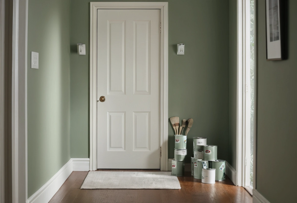
Paint sheen climbs a six-rung ladder: flat, matte, eggshell, satin, semi-gloss, gloss. The defaults that rarely miss: flat on ceilings, matte or eggshell on most walls, satin in kitchens, baths, and mudrooms, semi-gloss on trim, doors, and cabinets. Every step up the ladder wipes cleaner and lasts longer, and every step up also shows more wall flaws, roller marks, and touch-up patches.
The sheen ladder, with numbers
Sheen is measured as the percentage of light a dried film reflects at a set angle, usually 60 degrees. The names are marketing; the numbers are the truth, and they overlap between brands, so one company’s matte is another’s eggshell. Typical ranges run like this:
| Sheen | Gloss at 60 degrees (typical) | Default use |
|---|---|---|
| Flat | 0 to 5 percent | ceilings, low-traffic walls |
| Matte | 5 to 10 percent | bedrooms, living room walls |
| Eggshell | 10 to 25 percent | halls, family rooms |
| Satin | 25 to 35 percent | kitchens, baths, kids’ rooms |
| Semi-gloss | 35 to 70 percent | trim, doors, cabinets |
| Gloss | 70 percent and up | front doors, furniture, drama |
When two brands are in play, compare the gloss numbers on the data sheets, not the names on the cans. A seventh rung exists in catalogs, high gloss at 85 percent and up, but it is a specialty finish that demands near-perfect surfaces and usually spray application.
The core tradeoff: scrubbing vs. touch-ups
Higher sheen means a tighter, harder film. Satin and semi-gloss stand up to sponges, fingerprints, and the occasional degreaser, which is why they own kitchens and trim. Flat and matte have a porous, light-scattering surface that marks more easily and tolerates only gentle cleaning.
Touch-ups run the opposite way. Dab new paint on a flat wall and the repair disappears; do the same on eggshell or satin and the patch “flashes,” a shiny or dull ghost visible at an angle even though the color matches. The practical rule: where walls take abuse but you can repaint a whole wall when needed, go washable; where you want ten years of invisible spot repairs, stay flat or matte. Modern matte formulas have narrowed the durability gap, but the flashing problem has not gone away.
Two wear patterns are worth knowing by name. Burnishing is the shiny polish that develops where flat or matte paint gets rubbed, behind chairs, along stair walls, around switch plates; once burnished, the spot reflects light differently forever, and only a repaint hides it. Flashing is its inverse, the touch-up ghost on sheened walls. Every household ends up managing one or the other; traffic decides which.
Sheen by room and surface
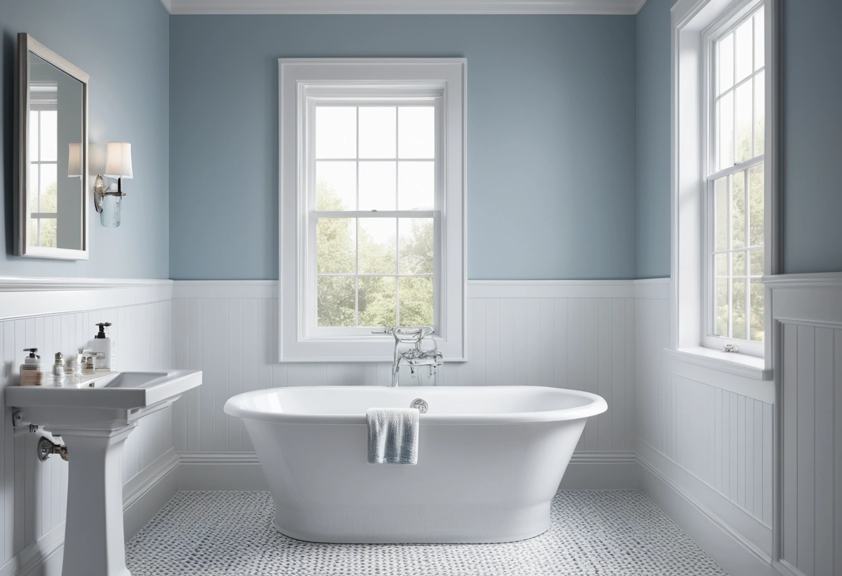
Bedrooms and living rooms: matte, or eggshell if the household is hard on walls. Halls and stairwells: eggshell for scuff resistance along the touch zone. Kitchens: satin on walls, semi-gloss on cabinets. Bathrooms: satin is the safe default for moisture; in a tight full bath, where every surface sits close to the shower, sheen matters as much as the fixture clearances in our small bathroom guide. Ceilings: flat, always, because raking light turns any sheen up there into a map of drywall seams. Dedicated ceiling paints are formulated even flatter than wall flat, typically 0 to 2 percent gloss, and spatter less off the roller; they earn their can on any ceiling bigger than a closet’s.
Trim, doors, and casings take semi-gloss in most homes: the hard film survives vacuum bumps and hand contact, and the step up in sheen from the wall reads as crisp tailoring. Keep trim one or two rungs glossier than the wall it borders.
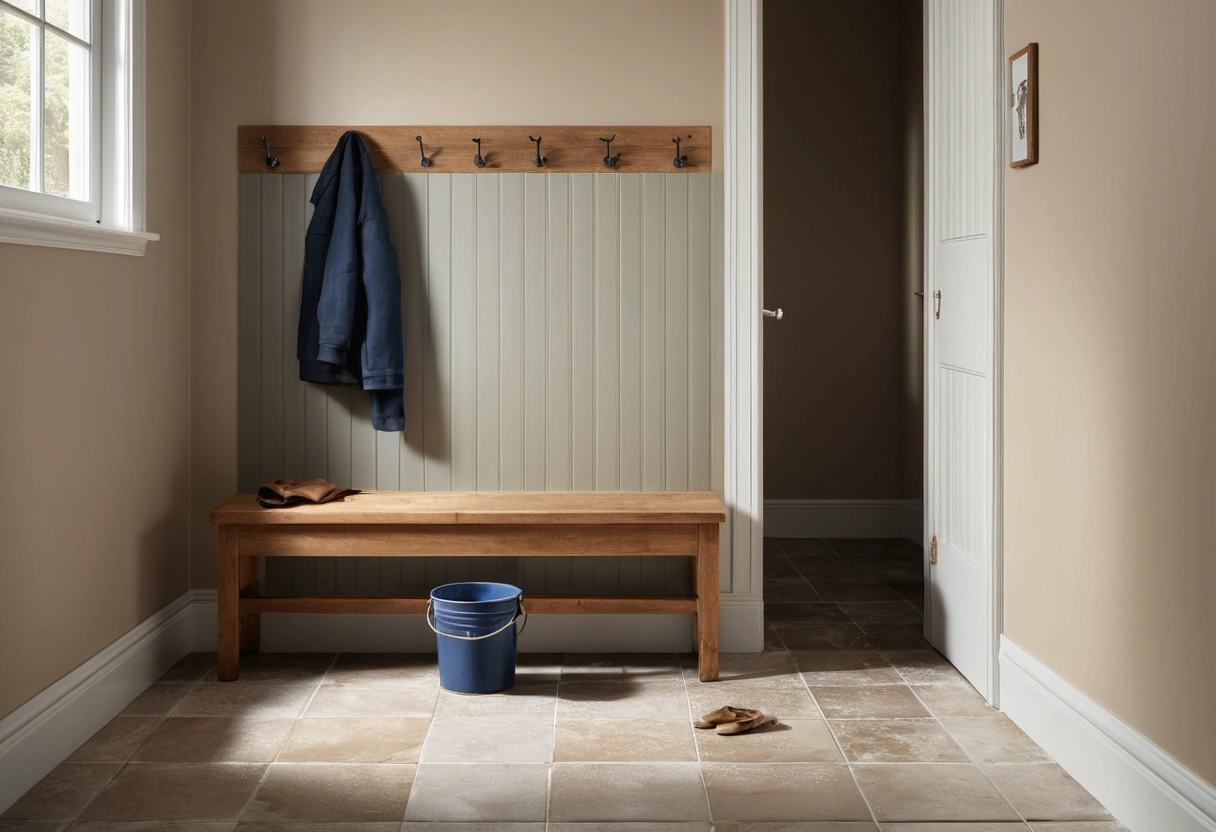
Households with kids, dogs, or a wall-touching hallway habit should shift every room one rung up the ladder and accept the touch-up penalty. A matte that needs repainting every year is not saving anyone money over an eggshell wiped monthly. Mudrooms and laundry rooms follow kitchen logic: satin on the walls, semi-gloss on anything with a handle.
How sheen changes the color you picked
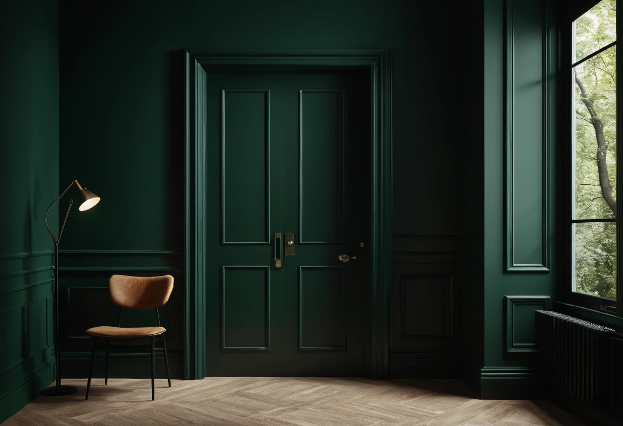
The same color code reads differently at each rung. Higher sheen reflects more light in a tight beam, so the color looks a touch darker, richer, and more saturated; flat scatters light, so the color reads softer, lighter, and slightly chalky. Move a mid-tone from matte to semi-gloss and it can look a half-shade deeper. The classic surprise is trim: run walls and trim in the same code, matte on the wall and semi-gloss on the wood, and the trim reads clearly richer by afternoon. That shift is free contrast when you want it, and a trap when the color was approved from a matte sample and the glossy doors come out deeper than planned.
Light direction amplifies all of it. Sun raking down a long wall, or wall-washing from cans set close to the wall at the distances in our recessed lighting spacing guide, exaggerates every ripple in a glossy film. Dark colors raise the stakes further, since scuffs and burnish marks show plainly on them, one of several reasons the sheen call matters extra with dark paint in small rooms. The only reliable prediction is a sample painted in the final sheen, viewed on the actual wall through a full day, per the routine in how to test paint colors.
Sheen can also be a design tool in its own right. Running one color in two or three sheens across walls, trim, and ceiling is the standard recipe for color drenching, where the sheen change does the work that contrast used to do.
Quick picks, surface by surface
- Ceilings: flat, no exceptions worth making.
- Adult bedrooms, dens, living rooms: matte.
- Halls, stairs, family rooms, kids’ rooms: eggshell to satin.
- Kitchen and bath walls: satin.
- Trim, doors, built-ins, cabinets: semi-gloss.
- Front door: semi-gloss or gloss.
- Repaints of flawed walls: stay low; sheen is a spotlight on bad drywall.
- Buying across brands: match the gloss percentage, not the name.