The 60-30-10 Rule: Room Color Proportions That Work
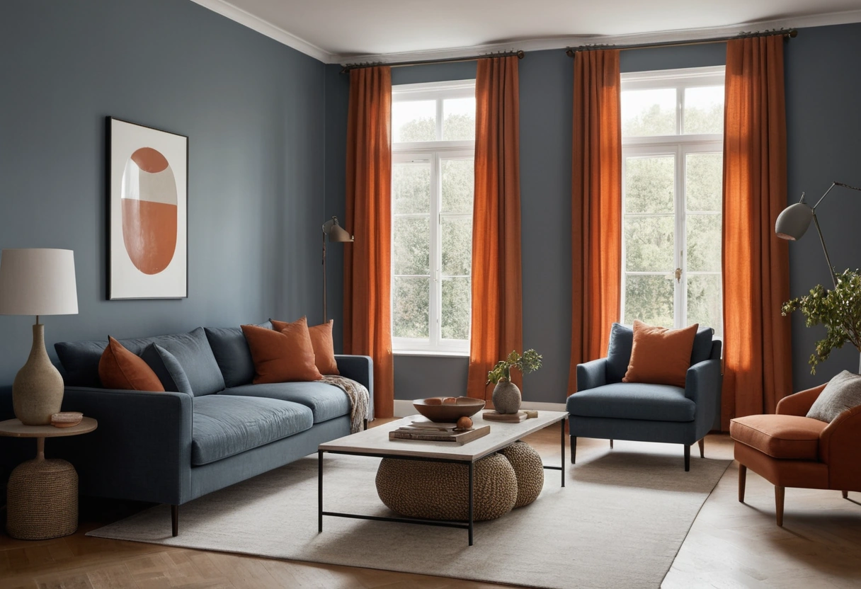
The 60-30-10 rule splits a room’s color into three shares: 60 percent dominant, 30 percent secondary, 10 percent accent. Mapped to a real room, walls, ceiling, and floor carry the 60; upholstery, curtains, and large case pieces carry the 30; pillows, art, lamps, and objects carry the 10. It is a decorator’s convention, not a law, and it is judged by eye from the doorway, not with a tape measure.
What the percentages actually measure
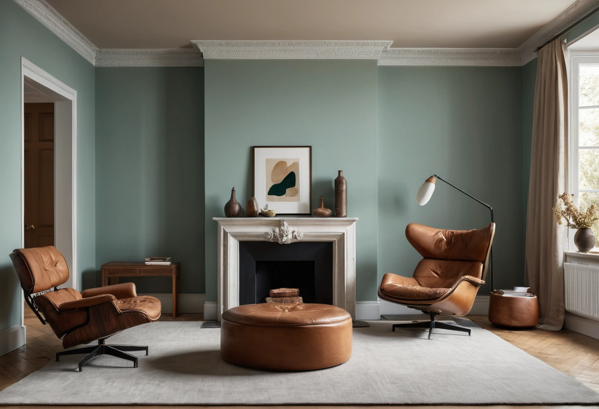
The rule describes your visual field, not gallons of paint or square footage. Stand at the room’s main entry and estimate how much of what you see belongs to each color. Ceilings and floors count whether you planned them or not: a white ceiling and a pale oak floor are usually part of the 60 by default.
Two conditions make the ratio work. First, the three shares should differ in value, one light, one mid, one dark or saturated, so the eye can tell them apart at a glance. Second, they should agree in temperature; a ratio cannot rescue colors whose leans fight, which is why it pays to check paint undertones before assigning any color a share.
Patterned fabric counts by its dominant color: a floral that reads mostly cream from across the room joins the cream share, whatever its accent blooms do up close. Judge patterns from ten feet, not in hand. Wood tones and metals count too; a walnut credenza is brown in the math even though nobody painted it. And estimates are enough. The ratio tolerates a ten-point swing in any direction before it stops reading as a hierarchy.
Mapping the shares to real surfaces
| Share | Typical carriers |
|---|---|
| 60 percent | walls, ceiling, floor or a large rug, the sofa in a small room |
| 30 percent | upholstery, curtains, bedding, an accent wall, big case pieces |
| 10 percent | pillows, throws, art, lamps, books, flowers, hardware |
The 60 is the background and should behave like one: usually a neutral or a muted color that other things sit against. The 30 mostly lives on fabric, which takes wear; if the secondary color rides the sofa and chairs, choose cloth by the thresholds in our guide to performance fabric ratings, because the secondary share is the one you touch every day.
The 10 is the cheap, swappable layer. Pillows, a throw, art mats, a vase: this is where seasonal changes happen for under a few hundred dollars, while the 60 and 30 stay put for years. Weight your budget the opposite way from the shares: spend on the 30, save on the 10.
Running the rule in an open plan
An open plan reads as one room, so it gets one 60: a single wall color across the whole space keeps the volume coherent. Then rotate the 30 and 10 by zone. The seating area might run navy as its secondary with brass and rust accents; the dining zone can shift to rust as its secondary with navy demoted to accent. Swapping the same colors between the 30 and 10 roles is the cleanest way to make zones feel related but distinct.
Zones themselves are defined by rugs and furniture groupings, and those need their clearances set first; the walkway and spacing numbers in our living room layout guide decide where each zone sits before color enters the picture. One caution: every zone’s accents appear in the same sightline, so audit the accent colors together, not room by room.
Ceilings and floors do the quiet connective work. One ceiling white and one continuous flooring material across the plan hold the 60 steady even while the zones swap their secondaries, which is why changing flooring at a zone line usually reads as a mistake.
When to break the rule
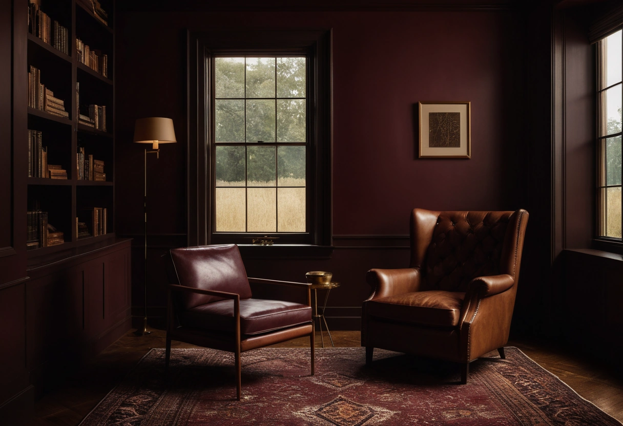
- 70-20-10 for calm. A bigger dominant share reads quieter. Bedrooms, small rooms, and minimal schemes often sit better at 70-20-10, where the secondary supports instead of competes.
- A fourth color. Keep the 60 and 30, then split the accent share into 5 and 5. Two accents at half strength read as intentional; three accents at full strength read as clutter.
- Black as seasoning. A long-standing decorator habit holds that a small dose of black settles almost any scheme: a lamp base, picture frames, cabinet hardware. Count it inside the 10.
- Dropping the ratio entirely. Monochrome rooms fold the 60 and 30 into one continuous color; that is color drenching, which trades proportion for immersion and follows its own rules.
Whatever ratio you land on, the colors available to it should come from the house-wide set. The flow logic in a whole-house color palette picks the team; 60-30-10 only assigns positions.
Two room recipes and a final check
Living room: warm greige walls, white ceiling, oak floor as the 60. Navy sofa and curtains as the 30. Brass, rust, and cream in pillows, art, and a lamp as the 10.
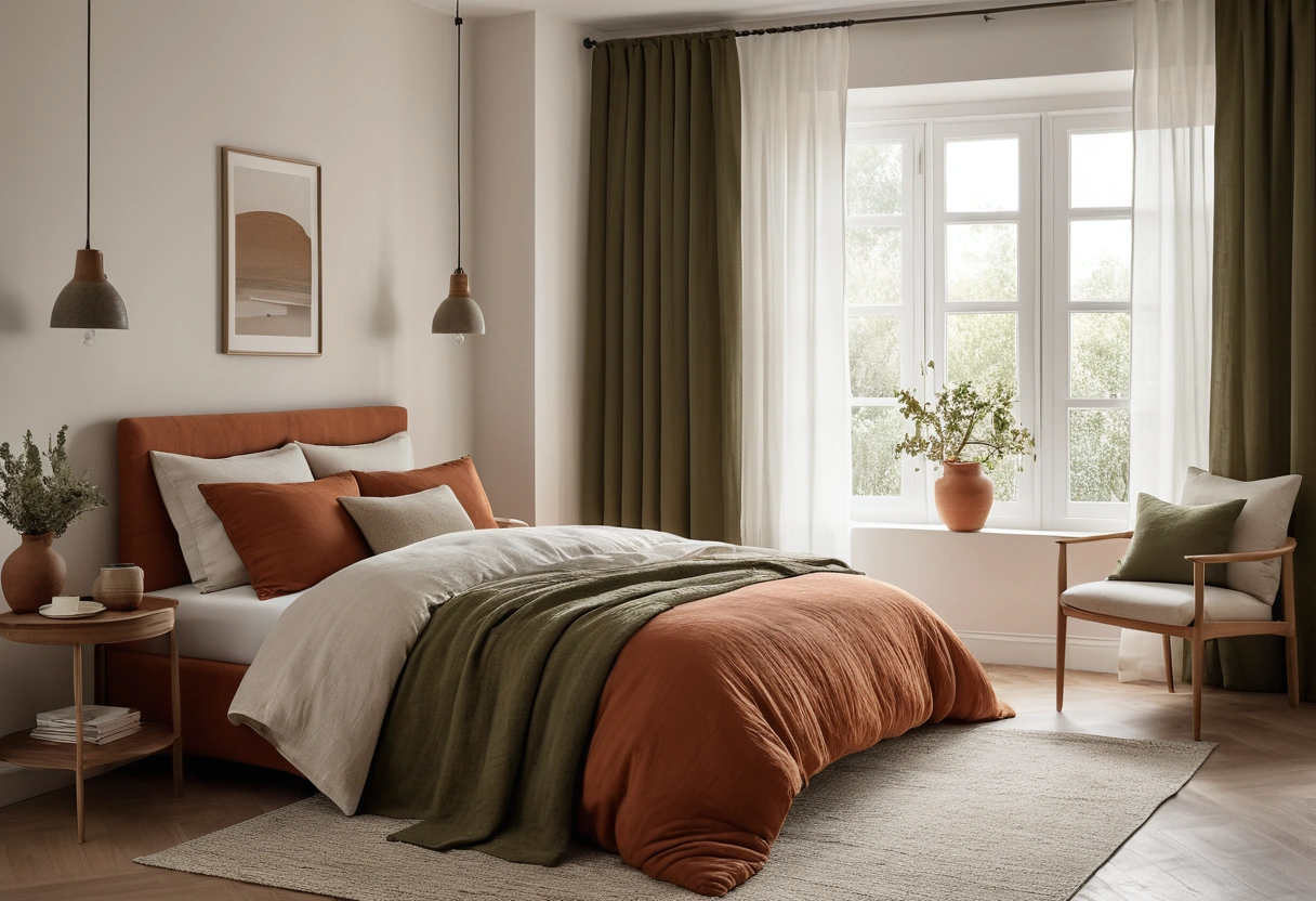
Bedroom at 70-20-10: soft white walls, ceiling, and bedding as the 70. Sage drapes and an upholstered headboard as the 20. Walnut nightstands and black-framed prints as the 10.
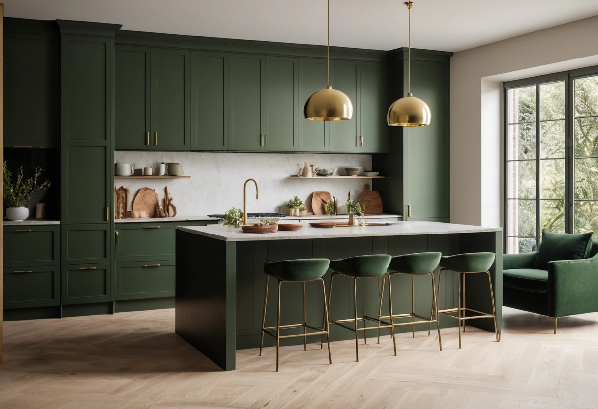
Kitchens run the same math with cabinets in the mix: white walls and ceiling as the 60, wood or painted cabinets as the 30, and the backsplash, stools, and hardware carrying the 10. Bathrooms compress it further: tile and walls as the 60, the vanity as the 30, towels and accessories as the 10.
Before you commit, run this check from the doorway:
- One color clearly dominates; nothing ties for first place.
- The three shares differ in value, light to dark.
- The secondary sits on cleanable, durable fabric.
- Accents repeat at least twice around the room, so they read as a decision.
- If the room feels busy, promote the ratio toward 70-20-10 rather than adding another color.